Evaluation:
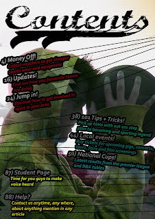
Huge title at the top stands out just like my front cover. My model is the same, with the same adjusted hue saturation to give that pearlescent effect again. A couple of my page titles are similar to those mentioned on my front cover e.g. ‘money off’ and ‘local events’. These similarities generate a continuous feel and can both be associated with each other. In the background, three other pictures of the same model can be lightly seen, as I have faded them out. I did this as it is a feature not often used, and looks pretty cool. I centered them around text, to further highlight the information I want the reader to take in.
After finishing I couldn’t help but there was something missing, with too many blank spaces. After experimenting with various effects and images, I decided on these lines, stretching to the sides, as if holding the text in place. The only reason for this is that it looks funky.
I decided on this as my background picture as it is identifiable to my front cover and positioned in a sort of ‘thinking’ position, suggests there is also strategy and thinking involved in sport.
