Thursday, 17 December 2009

Pre-Production SlideShow (30)

Reader Profile (32)

(33) What My Magazine is all about.

Pro Pella is exactly what is says. Pro is a Positive or great thing and Pella is an ancient translation from the word “music”. Another translation is “city of refuge” which can be reflected in my front cover, showing an old city alley way. I can be certain that my magazine will appeal to my target market, through including features, articles, information, gifts and loads more, all relating to my market. My surveys have given me a range of ideas of how to further pull in costumers, from details on price, to content. Referring back to both my mood board and surveys will allow me to bring both what my readers want, and what certain features attract me, together.
I will centre the premise and USP of my magazine around the notion “we’re pro music” constantly through out the magazine, suggesting music is the most important thing in their lives. Enforcing this notion on my front cover, will then mean I can juxtapose more light, easy reading issues, such as band’s favourite pass times e.c.t. using such articles, and addressing bands in an informal, first person context, will include the reader almost directly, making them feel as if they are there, experiencing the interview. I am very keen on using a unique, cartoon like style within my magazine. I feel mixing both real life, artistic photographs, with light, entertaining cartoons will give a great effect. I also feel this style will suggest “Pro-Pella” can offer an escape from reality, taking you into the world of music.

Thursday, 19 November 2009

Front Covers (21)


Q Magazine: 94,811 Total Average Net Circulation Per Issue
NME (New Musical Express): 38,486 Total Average Net Circulation Per Issue
Rock Sound: 20,011 Total Average Net Circulation Per Issue

Mood board (19)

Contents Page (23)


Q Magazine: 94,811 Total Average Net Circulation Per Issue
NME (New Musical Express): 38,486 Total Average Net Circulation Per Issue
Rock Sound: 20,011 Total Average Net Circulation Per Issue

Double Page Spread (25)


Q Magazine: 94,811 Total Average Net Circulation Per Issue
NME (New Musical Express): 38,486 Total Average Net Circulation Per Issue
Rock Sound: 20,011 Total Average Net Circulation Per Issue

Tuesday, 10 November 2009

SlideShow


Here is a slideshow of my favourtie CD covers. I have a short anlysis of each one, enjoy.

THIS WAS ACTUALLY POSTED THURSDAY 24TH SEPTEMBER 2009 THERE IS THE PROOF -http://martinwatts93.blogspot.com/

Front Cover


Here is my front cover of the CD. I have my two models looking into the distance for a more natural, unforced appearence. After adjusting the colour and contrast of the images, I experimented with the filters and gave them a textured look. I felt this made the pictures look more abstract and stand out from other CD covers of its type. After editing the images to my liking, I adjusted the canvas size to appropriately fit a CD case, and added some final details; Parental Advisory sticker and Album name. The stlye of my music is indie, which i think is reflected in this photo.

THIS WAS ACTUALLY POSTED THURSDAY 24TH SEPTEMBER 2009 THERE IS THE PROOF -http://martinwatts93.blogspot.com/

Back Cover


This is my Back cover, with my two models again, so that passers by can easily associate this picture with the band. the song titles i picked i thought were appropriate to the genre of my music. i have also added a bar code for a more authentic look. After deciding I was happy with the photo, I started to adjust the contrast and Hue Saturation to give the photo a lighter appearance, and the models a healthier glow.

THIS WAS ACTUALLY POSTED THURSDAY 24TH SEPTEMBER 2009 THERE IS THE PROOF -http://martinwatts93.blogspot.com/

Progress of CD


THIS WAS ACTUALLY POSTED THURSDAY OCT 1ST 2009 - Proof http://martinwatts93.blogspot.com/

Thursday, 5 November 2009

Magazine progress 2

Magazine Cover progress1

me sketch


at the begining of this project, i started to jot down the main features i was certasin i wanted to include in my magazine. As more of these ideas came, i started to illustrate them into a sketch. I added to this each time something else inspired me, or whenever i thought of something cool to add. After a short time, i had a rough template of what i wanted my magazine to look like. Any time during my physical final design i coudln't think, i would either refer back to this, or my reasearch powerpoint. without this sketch, i feel i would have left major features out that give my magazine the authentic look i feel it has now.

Tuesday, 3 November 2009

front cover


Evaluation:
My mast head is big and black; it stands out on the blue/purple background. I have cut around my models head to create a funky style, using his head as the “o” in the word Sport. Underneath my mast head is NCC outlined in white, to secure the fact that this is a College magazine. In my sky line is the date, and brief outline of what is in the magazine, and a bright price to reveal it’s USP of being cheaper than others.
I have situated most of my text within the left hand side of my cover, doing this allows for key features to still be visible if stacked on a shelf.
Using the term ‘number 1’ suggests this is the best magazine, encouraging some to buy it over other competitors. Immediate after my slogo are three brief bullet points, stating a few articles within.
a pull quote is next down, reading ‘time to jump into the court… or pitch… or ring’. I have played on the phrase ‘time to jump in’ meaning to take part and get involved, including words relating to sports. At the very bottom of my page are three points, highlight the three main topics concentrated in this magazine. A bar code to the right gives a more authentic feel.
I chose this as my main picture, because I felt that my models stance creates a powerful message, painting sport as big and robust. The pearlescent background is really bold and abstract, different to others you might see, appealing to an audience through uniqueness.

Monday, 2 November 2009

Slide show


Many of these covers and contents pages inspired my design. i refered back to this slide show, and used it as my inspiration, as apose to using 1 definate cover.

Thursday, 22 October 2009

contents


Evaluation:
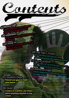
Huge title at the top stands out just like my front cover. My model is the same, with the same adjusted hue saturation to give that pearlescent effect again. A couple of my page titles are similar to those mentioned on my front cover e.g. ‘money off’ and ‘local events’. These similarities generate a continuous feel and can both be associated with each other. In the background, three other pictures of the same model can be lightly seen, as I have faded them out. I did this as it is a feature not often used, and looks pretty cool. I centered them around text, to further highlight the information I want the reader to take in.
After finishing I couldn’t help but there was something missing, with too many blank spaces. After experimenting with various effects and images, I decided on these lines, stretching to the sides, as if holding the text in place. The only reason for this is that it looks funky.
I decided on this as my background picture as it is identifiable to my front cover and positioned in a sort of ‘thinking’ position, suggests there is also strategy and thinking involved in sport.